Green is the colour I keep coming back to. In fact, I’d go so far as to say it’s the most useful tool in my designer’s kit when staging properties for sale or specifying finishes for developers.
Why? Because it works. Psychologically, aesthetically, commercially.
It brings calm and character, it’s easy on the eye, and when done right, it adds that elusive “this just feels right” reaction that turns a viewing into a sale. So if you’re a property developer or investor who’s serious about getting results, think of green as a strategy to sell (or rent).
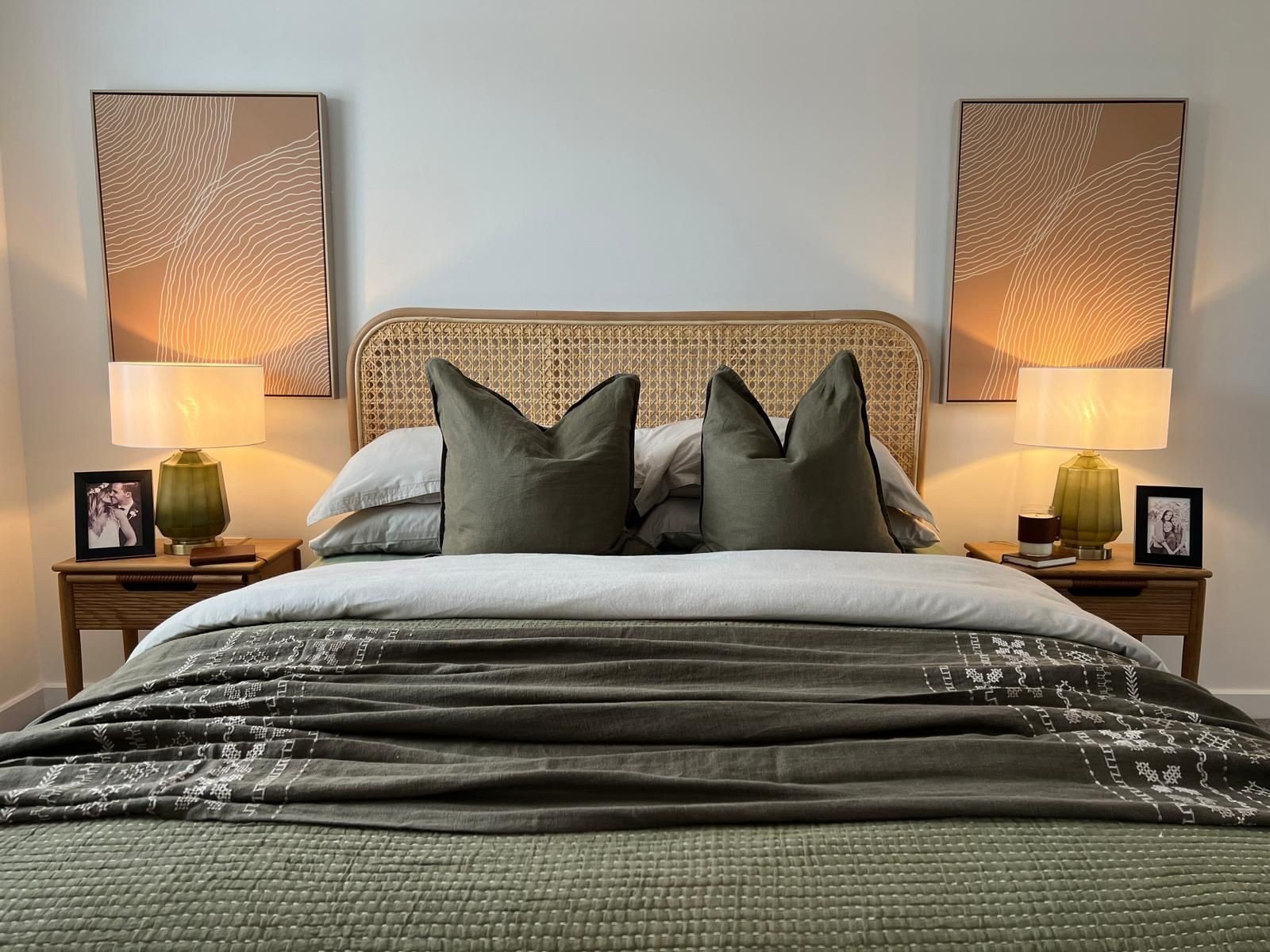
Serene in green.
Why green makes sense (literally)
Let’s talk colour psychology in property development for a second.
Green sits bang in the middle of the visible light spectrum, right between the longer wavelengths (like red) and shorter ones (like violet). That means your eyes don’t need to adjust to take it in, unlike bolder or more saturated colours.
From a physiological point of view, green causes the least strain. It’s restful, and that’s key when you’re selling property. Viewers won’t consciously notice it, but they’ll feel more relaxed, more at home, and less overwhelmed; especially useful if they’re walking through a development they’ve never seen before.
Psychologically, green is linked to growth, health, nature, and equilibrium. We’re evolutionarily wired to feel safe and calm in green spaces, it’s what kept us alive out in the wild. That feeling of safety translates today into comfort, confidence and, importantly, trust.
And trust sells houses.
But isn’t everyone using green?
They are, and that’s not a bad thing. But here’s where it gets repetitive: people keep pairing beautiful greens with safe, cold greys on the woodwork. It flattens and dulls the scheme and loses that sense of intention. If you want a property to stand out, you have to do better than default grey.
Which is why I’ve pulled together three of my favourite green-based interior paint palettes. They’re layered, modern, and perfect for creating interiors that feel calm and confident, with just enough edge to stand out.
Three green palettes that always deliver
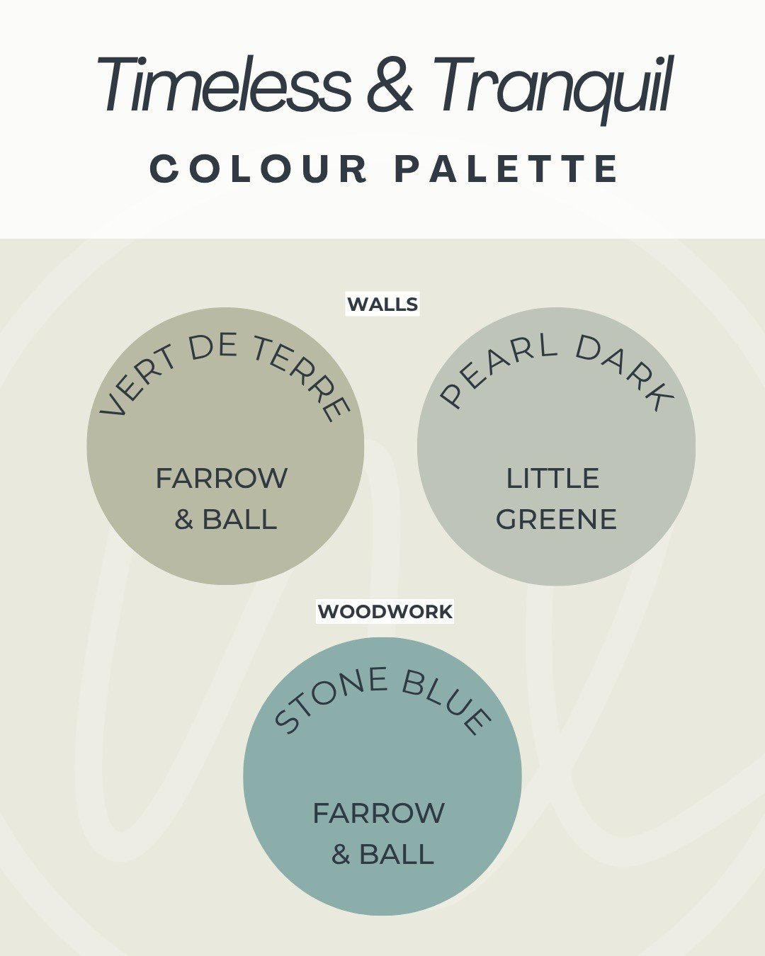
Palette 1: Timeless and Tranquil
Walls:
or
Woodwork:
Woodwork: Stone Blue – Farrow & Ball
Calm, layered and beautifully soft. This works especially well in period homes or traditional builds, where you want a nod to heritage without the space feeling too trad.
The blue on the woodwork brings depth and personality that you won’t get with white or grey. Give it a try, go on!
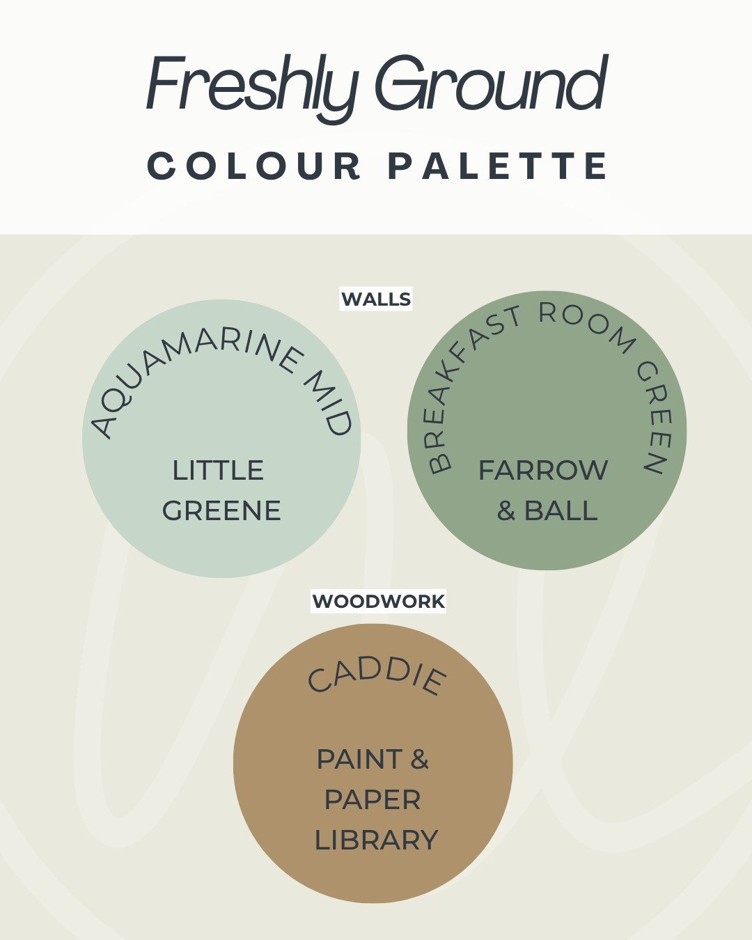
Palette 2: Freshly Ground
Walls:
Aquamarine Mid – Little Greene
or
Breakfast Room Green – Farrow & Ball
Woodwork:
For more contemporary or design-led properties, this is a punchier choice. The green is fresh, but not minty or clinical, and the warm ochre woodwork brings in an earthiness that balances the whole scheme.
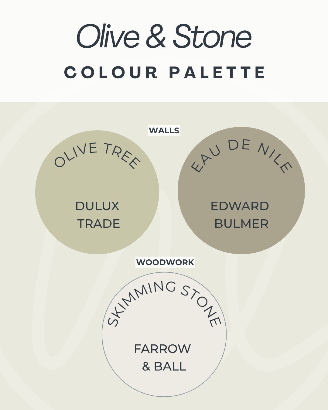
Palette 3: Olive & Stone
Walls:
or
Woodwork:
Ideal for northern light or smaller rooms, this palette feels rich but gentle. The olive keeps the warmth, and the chalky woodwork keeps everything looking deliberate, not thrown together.
It’s a quiet, grounded palette that feels considered and confident.
More reasons to go green
It transitions beautifully across seasons
Unlike cooler blues or autumnal oranges, green doesn’t lean too hard into any particular season. That means it photographs well year-round, whether you’re listing a property in July or January. For developers with longer lead times, this gives you extra confidence that the space won’t feel off-trend six months down the line.
It works in literally any room
There isn’t a single space in the home where green doesn’t work. Bedrooms, living rooms, bathrooms, even kitchens. Soft greens are restful, dark greens are luxurious, mid-greens are fresh. No other colour has that kind of flexibility without becoming tiring or overpowering.
It plays well with natural materials
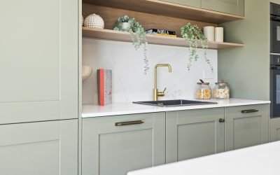
If you’re using timber, stone, rattan, linen, clay tones, or brass finishes, green enhances them. It amplifies warmth, adds depth, and makes your hard finishes feel more considered. You’re not just choosing a paint colour, you’re completing the whole look.
Green helps sell a lifestyle, not just a room
Buyers aren’t just choosing a floorplan, they’re buying into a feeling. A calm, clean, well-dressed green space feels curated, intentional and modern, without trying too hard. And if they feel like they could live there the moment they step in, you’re already halfway to a sale.
Final thought for developers
You don’t need to go full on bold to make an impact. You need to be smart with your colour choices.
Green is one of the safest and most effective design decisions you can make when staging property or planning interior finishes, but only if you use it well (and I don’t mean boring safe, I mean clever safe!).
Pair it with the right woodwork colour, consider your light levels, and you’ll end up with a scheme that sells itself.
Want help putting together a green interior palette for your next development?