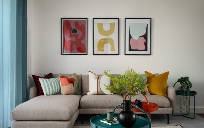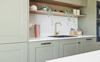
What colour should you paint a property before putting it on the market? Warm white? Beige? Or, now that grey has had rather a long innings… sage green?
Warm whites, soft neutrals and muted greens are all worth considering, but the best paint colours for selling a house are the ones that work with the property, its light, its finishes and the people you want to attract. There isn’t one shade that gets it right everywhere.
For developers and investors, colour should be part of the sales strategy, not simply whatever the decorator has left in the van.
And it certainly shouldn’t be chosen just because everyone else is using it.
Dulux’s choice of Soulful Sage™ as its Colour of the Year for 2027 gives us a timely example. It’s a soft, silvery green with plenty of appeal. But does that mean every developer should rush out and paint every wall sage?
Absolutely not!
In This Article
What are the best paint colours for selling a house?
When choosing the best paint colours for selling a house, we would start with warm whites, soft neutrals and carefully chosen muted colours – not specify a single shade before we have even looked at the property.
Here’s how we would approach the options.
Warm whites and off-whites
Worth considering when you want a quiet backdrop that lets the architecture, furnishings or views take the lead.
But white is not just white. Put a few samples beside each other and you will soon see the differences: some look creamy, some pinkish, some grey.
Check them against the kitchen, flooring and worktops. A white that looks lovely on the sample card can look completely wrong beside a fixed finish.
Soft neutrals
Stone, taupe, beige and other warm neutrals are options when you want more depth without a strong colour statement.
We would consider these where the brief calls for a softer backdrop, particularly if the existing materials already bring plenty of character.
Neutral does not have to mean flat or forgettable, but it does need to be chosen with as much thought as a stronger colour.
Muted greens and other soft colours
Sage, olive and soft blue-greens are worth exploring where they suit the building, the light and the overall scheme. They’re definitely some of the best paint colours for selling a house in our Northern hemisphere light.
You will also see these colours in House Beautiful’s guide to paint colours for selling a home, alongside warm whites and neutrals.
That gives you options. Not a guaranteed recipe for a higher sale price.
The important thing is to look at the whole room, not just the paint chart. “Neutral” does not automatically mean right and “on trend” does not automatically mean wrong.
Every year, paint companies announce their Colour of the Year and, almost immediately, it appears everywhere: on social media, in interiors magazines, across mood boards and, before long, on developers’ specification lists.
What can the latest colour trends tell property developers?
For 2027, Dulux has chosen Soulful Sage™, a soft, silvery green. Its latest colour stories are built around the idea that people are feeling weighed down by modern life and want a little light relief at home.
And we completely understand why.
Life feels busy. Homes are expected to work harder than ever. They are places to live, work, rest, entertain and switch off.
So the appeal of a softer, nature-inspired palette makes sense.
But the most useful thing about a Colour of the Year is the thinking behind it. What emotional need is the brand responding to? And is that relevant to the people you want to buy your property?
Why is sage green getting so much attention?
Dulux’s thinking connects sage with nature, lightness and a more restorative home environment.
That brings us to biophilic design: connecting people with nature through the built environment. Colour can contribute to that approach, but it is not the whole story. Materials, daylight, planting and views deserve attention too.
At WildKind, we use applied colour and design psychology to think about the atmosphere a space needs to create for its intended end user. That means looking beyond whether a shade is fashionable or whether we happen to like it.
Green can be a useful starting point. But which green?
A warm sage, a silvery grey-green and a stronger yellow-green are not interchangeable. Put them beside the same flooring and kitchen and you have three different schemes.
Our introduction to colour in interior design explores why we give colour so much attention. It is a design decision, not something to squeeze in after everything else has been ordered.
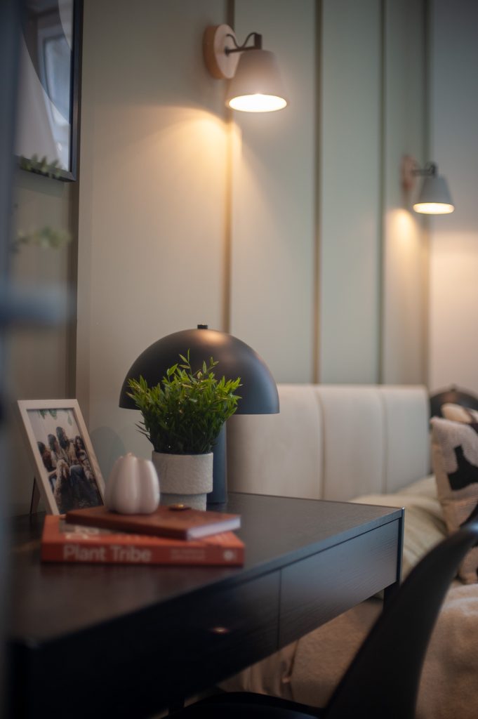
Please don’t replace grey with sage
For years, grey was the go-to colour in property. It was neutral, safe and easy to specify.
But once every developer, landlord and showhome started using the same formula, interiors quickly became indistinguishable.
Cold grey walls, grey flooring, grey kitchens and grey furniture: the shortcut to a finished-looking scheme, usually topped off with a token “pop of colour”. Yawn.
That is not really design. It is copying what everyone else is doing.
The problem wasn’t simply the existence of grey. It was the lack of thought about the property and the people who would actually live there.
If sage now becomes the new default, we will have made exactly the same mistake again.
Different paint tin. Same problem.
The aim should be to understand the buyer, the property and the feeling you are trying to create.
How do you choose the right paint colour for your property?
Before choosing a paint colour, we would always ask:
- Who is the intended buyer?
- What do they need this space to do for them?
- How does the room look in natural and artificial light?
- What fixed finishes are already in place?
- Does this colour support the price point and positioning of the development?
These are not questions to save until the decorator needs an answer by Friday.
They belong in the design brief.
Start with the buyer, not your favourite colour
A family buying a three-bedroom home in a suburban development may be looking for comfort, practicality and somewhere they can imagine staying for years.
A buyer considering a city apartment may have different priorities: a workable home-office space, room to entertain or an interior that feels considered without needing an immediate overhaul.
Neither brief gives you a paint colour automatically. But it gives you a much better starting point than “What’s popular on Instagram?”
If you are selling your own home, the same principle applies. The question is no longer just what you enjoy living with. It is how to present the property to its next owner.
Test the colour in the actual space
Please don’t approve a whole development’s paint from a tiny swatch on your desk.
A shade that looks beautiful in a bright south-facing showhome may look quite different in a north-facing apartment.
Test your shortlist in the property. Look at it at different times of day and under the lighting you intend to use. Dulux’s guidance for Soulful Sage also recommends testing the colour so you can see how it looks in your space before painting.
You are choosing a colour for a room, not for a sample card.
Put the finishes together
The kitchen, flooring, tiles and worktops are part of your colour scheme whether you have thought about them that way or not.
A paint sample that works beside pale oak and warm stone may be the wrong choice alongside a cool grey kitchen or blue-toned flooring.
Put the samples together before signing anything off.
It is a much better time to discover a mismatch than after the kitchen has arrived.
Keep the price point in view
What does the property need to communicate?
Practical and well considered? Characterful and distinctive? Quietly premium?
A higher price point does not automatically call for stronger colour or more expensive paint. We would look first at whether the palette, materials, lighting and detailing make sense together.
For a developer, the commercial question is whether the specification supports the intended market position and GDV (the gross development value) not whether it ticks off this year’s trends.
Where can sage work in a property for sale?
Used carefully, sage can be a useful part of a scheme. The question is where it adds something and where it doesn’t.
In a showhome
A living room, bedroom or home office can be a good place to explore sage alongside warm lighting, soft textiles, timber and tactile finishes.
But think about what you want the buyer to notice.
The comfortable seating area? The usable layout? The fact that the smallest bedroom really can work as an office?
The colour should support the room’s purpose, not become the only thing anyone remembers.
In a premium development
Sage can form part of a layered palette alongside natural stone, timber, aged brass and linen.
The key is not to make it feel like a trend wall. We would want it to look intentional and connected to the architecture of the space.
A rural church conversion and a contemporary city apartment do not need the same scheme simply because both are being marketed at a premium.
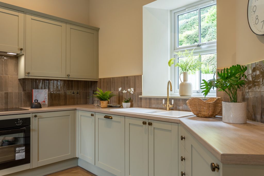
Through details rather than every wall
You don’t have to cover every surface to introduce a colour.
Sage might be better suited to upholstery, artwork, a piece of joinery or smaller painted details.
If the property is already decorated and ready for market, repainting may not be the best use of the budget. We would first look at what can be achieved through furniture, lighting and styling.
Our property staging service is designed around that distinction: furnishing and presenting a property for sale, rather than automatically making permanent changes.
Do you need green to create a calm, nature-inspired interior?
No – green is not a compulsory ingredient.
Depending on the property, we might explore soft blue-greens, warm neutrals, muted clay tones or a palette led by natural materials instead.
The colour is only one part of the picture. Lighting, texture, furniture, layout and the relationship with outdoor views all deserve attention.
Painting a room sage does not resolve an awkward layout or make an uncomfortable room inviting.
Our wider guide to interior design trends for developers looks at colour alongside the fixtures, finishes and details that bring a scheme together.
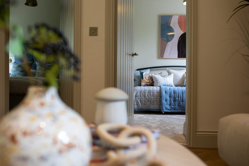
How do you follow colour trends without dating the property?
The smarter approach is to understand what appeals about a trend and translate it in a way that suits your buyer.
That might mean sage walls. It might mean a warmer neutral palette with timber and textured fabrics. It might mean leaving the walls alone and changing the furniture and lighting.
Before committing to a fashionable finish, ask:
- Would we choose this if it were not currently on trend?
- Does it suit the building and intended buyer?
- How expensive or disruptive would it be to change?
- Could we achieve the effect through something more flexible?
That does not mean every permanent finish should be bland.
It means being deliberate about where you commit your budget. Repainting a room is one thing. Replacing a kitchen because the scheme never quite worked is another.
Will a particular paint colour help your house sell for more?
We would not promise a higher sale price or a quicker sale because you have chosen one particular shade.
A manufacturer’s Colour of the Year announcement is inspiration, not evidence of a property-value uplift.
What we would look at is whether the colour choices support the presentation of the property as a whole.
Do the finishes work together? Is the specification appropriate for the asking price? Can buyers understand the space and imagine living there? Is the interior giving your agent something worth showing in the marketing photography?
Those are the useful questions.
The commercial aim is to strengthen buyer appeal and support the asking price, while avoiding unnecessary spend or rework. Paint contributes to that. It cannot do the whole job on its own.
Choose for the buyer, not the paint trend
So, what are the best paint colours for selling a house?
The ones chosen with a clear understanding of the buyer, the property and the rest of the scheme – not simply the ones at the front of the paint shop.
Warm whites, soft neutrals and muted colours all deserve consideration. Sage may be exactly right. It may not.
Use the latest colour forecast as inspiration, not an instruction.
And please don’t swap an all-grey formula for an all-sage one and call it a strategy.
Preparing a property for sale? Explore WildKind’s property staging service. We work with developers, investors and homeowners across the UK, bringing the buyer, the property and the sales strategy into the same conversation—before anyone starts choosing cushions.
By Louise Wynne, founder of WildKind Interiors. Louise has been designing, styling and installing showhomes since 2006 and has trained in applied colour and design psychology with Karen Haller.